Lemmy_kilmister
Well-known member
Do this and all will be well


Is it a new badge forever after, or a new badge to mark / celebrate our 150th to be used for a season and on memorabilia, then revert to the current horror show?

Ah the wrong bridge is but a minor detail...I like it but does there need to be space between 18 and 76?
Plus, do we need the outer circle and the two current badges? I'm assuming AI has done this?
I think the middle bit with the lion, bridge and date would be good.
Would be better if it was the actual Transporter though and not the Golden Gate Bridge in San Francisco.

This is nice. I’d like this one. I’d vote for the 1986 one with the old date on it tbh, but this one you’ve posted ticks all the boxes.

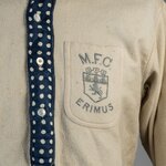
Needs a more prominent lion and our lion.
New badge.Is it a new badge forever after, or a new badge to mark / celebrate our 150th to be used for a season and on memorabilia, then revert to the current horror show?
Needs to have a red lionView attachment 74090
New badge to be used from the 2026/27 season onwards.