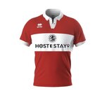
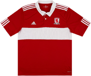
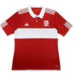
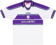
Favourite Boro Kit

Home.
Red shirt, white band preferably all the way round. White collar (design the only variable by season). Band is fundamental. Never just red. We are not Liverpool,
Red shorts with white side stripe. Never ever white shorts - horrendous, we are not Man U.
Red socks with white trim.

Never a yoke, or a belly band, or sash, or daft white patches, or terrible pinstripes. They all look like someone we're not.
Have the band as our obvious identity.

Away.
Keep the shirt chest band and two colour contrast across shorts and socks. Maintain the identity, home and away,
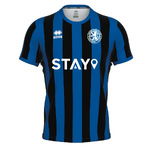
The Inter Milan blue and black could work as a colour combination.
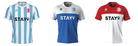
Simply reversing the red and white of the home strip would work.
There are lots of away two colour contrasts that could work with the band identity.

Stop trying to be clever with it, we already have a fabulous template that can be tweaked to ensure fans keep buying the new editions.
Tell the manufacturer don't take their templates.
 
The Evening Gazette shirts were the best. I’m an advocate for the white band but those 1990-92 kits are what we wore at the first game I went to and I’ve always thought they’re the business.

The perfect shade of red, a nice and proper white collar, distinctive trims on the sleeves and the local paper as the sponsor. They don’t make them any better IMO.

I’m not a fan of these flashes of dark navy blue that they have now, or the years we wear white socks. Just simple red shirts with white accents, white shorts - *possibly* red shorts TBF - and red socks(or red stockings as Ali Brownlie used to say).

And what actually ruins modern football shirts is the sponsors. You can design a really nice shirt and then ruin it with a massive pawnbrokers or gambling logo. Plus the sleeve and nape sponsors, and the huge EFL sleeve patches. Whatever Errea decide to do, it’ll probably be seriously affected by all of that nonsense anyway.
 
Last edited:
Home:
White band no matter what (solid band - not like this season)
Everything else can alter to create some interest

Away:
We’re due a black and blue stripe (with some red in their 95/96 style. Magical time, new stadium, new era but historical too from 70s promotion, etc.
Also, like the pale blue and navy, kits from late 80s/early 90s. We had a nice kit with these colours around 12/13 season?
 
The Evening Gazette shirts were the best. I’m an advocate for the white band but those 1990-92 kits are what we wore at the first game I went to and I’ve always thought they’re the business.

The perfect shade of red, a nice and proper white collar, distinctive trims on the sleeves and the local paper as the sponsor. They don’t make them any better IMO.

I’m not a fan of these flashes of dark navy blue that they have now, or the years we wear white socks. Just simple red shirts with white accents, white shorts - *possibly* red shorts TBF - and red socks(or red stockings as Ali Brownlie used to say).

And what actually ruins modern football shirts is the sponsors. You can design a really nice shirt and then ruin it with a massive pawnbrokers or gambling logo. Plus the sleeve and nape sponsors, and the huge EFL sleeve patches. Whatever Errea decide to do, it’ll probably be seriously affected by all of that nonsense anyway.
Well, indeed. The current shirt is designed to show off the sponsor. We've actually gone beyond ruining a shirt by putting the sponsor on it, to making the shirt look bad if it doesn't have the sponsor on it. A sad state of affairs.
 
Another vote for the 70s adidas white band home kit, considered a classic by non Boro fans too. I actually like the current white third kit, which is a throw back to the 92/93 Admiral kit. I loved the two Admiral away kits we wore between 92 & 94.
 
Home

9Dr3D6lE69s7M5T.jpg
No sponsor, white band. Bloody lovely. I own this shirt, shame about the football back then though.

Away
p45069983-1_ovwwtoemkdbkhfp0.jpg
A real "marmite" shirt this one, but I absolutely love it. Used to refer to it as the "Reverse Cadbury" for obvious reasons.

Third

boro-20-21-third-kit (2).jpg
I mean just look at it, it's bloody gorgeous isn't it?
 
The home kit is red with the white band, the variable being the collar style and colour, but I do like white for that as well This wasn't our identity at the beginning but it is now, if we wear them we are a walking advert for the club because it is so identifiable.

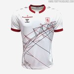
The away. This year's away is probably the best I have seen but also I think for us simplicity and the classic styles associated with us are best, so a white strip with a red band, however as this year's style as shown it could be any combo of two colours for shirt and band.
 
Back
Top