You are using an out of date browser. It may not display this or other websites correctly.
You should upgrade or use an alternative browser.
You should upgrade or use an alternative browser.
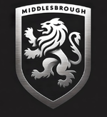
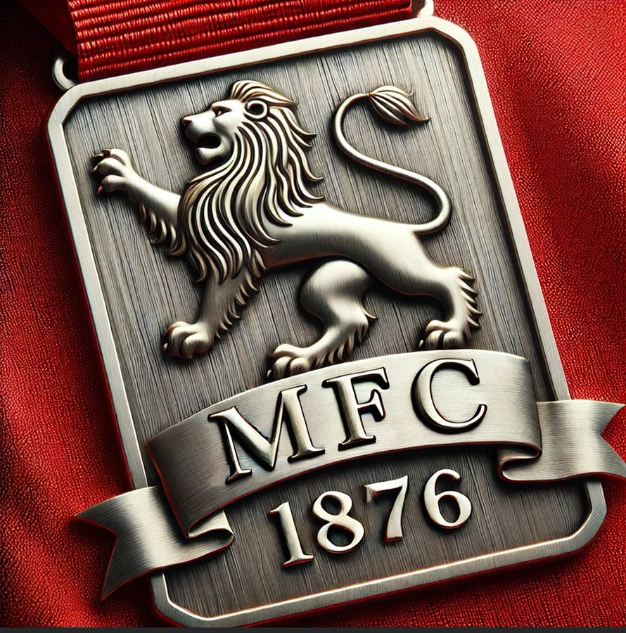
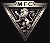
Exclusive: New Boro Badge Revealed*
- Thread starter SmoggyParmo
- Start date
SmoggyParmo
Well-known member
SmoggyParmo
Well-known member
SmoggyParmo
Well-known member
SmoggyParmo
Well-known member
SmoggyParmo
Well-known member
SmoggyParmo
Well-known member
SmoggyParmo
Well-known member
SmoggyParmo
Well-known member
SmoggyParmo
Well-known member
SmoggyParmo
Well-known member
SmoggyParmo
Well-known member
SmoggyParmo
Well-known member
Last one for the night
El Guapo
Well-known member
Personally I’d make the rose bigger, I’d lose the crest sail from the ship and have just a normal sail and I’d make the ship smaller and lower it down into the bottom red band (or preferably I’d have a compass there) But that’s just me.
Just for the anniversary season inly, then a simpler design going forward.
Last edited:
El Guapo
Well-known member
Prefer this IH to the other one I.e. this IH with the comments above.
Again Jimho, it’s all very subjective.
El Guapo
Well-known member
I agree with your last para and think for the new badge we should do so, but I think something more ornate could be done for the anniversary year only and only be on the actual shirts, doesn’t have to be plastered everywhere or on the casual wear merch etc.As lovely and artistic as some of these are, I have to agree with some folks that we overestimate just how much will actually go unti the finised design and product.
The final design will need to encompass such factors as how easy it is to be printed on clothing, how will look against multiple colour backgrounds, how easy it will be to Feature on social media, how easy it will be to replicate on other mediums etc.
Some of these look great as pin badges for example but there is no way the finished article will look anything like any of these.
I think it will be Some reconfiguration of the 1986 badge. Let’s hope they just do it simple, cool, long-standing and something we can associate as being part of our club.
Last edited:
SmoggyParmo
Well-known member
What about going back to where it all started: https://www.grahambuddauctions.co.uk/news-blog/2022/12/136-year-old-shirt
and recreating the pocket badge used in the 1890s shirt. I've upscaled the detail a bit but original photo is in above link.
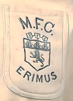
Did we not use this or similar for a Sampdoria game the season the riverside opened?
so badge would look like a stitched pocket for the 150th year anniversary.
and recreating the pocket badge used in the 1890s shirt. I've upscaled the detail a bit but original photo is in above link.

Did we not use this or similar for a Sampdoria game the season the riverside opened?
so badge would look like a stitched pocket for the 150th year anniversary.
newyddion
Well-known member
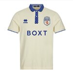
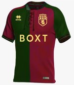
I offered up this effort as a possible away shirt for our 150th Anniversary..What about going back to where it all started: https://www.grahambuddauctions.co.uk/news-blog/2022/12/136-year-old-shirt
and recreating the pocket badge used in the 1890s shirt. I've upscaled the detail a bit but original photo is in above link.
Did we not use this or similar for a Sampdoria game the season the riverside opened?
so badge would look like a stitched pocket for the 150th year anniversary.
