Adidas on the whole was a disaster for me. A shame as if they kept it simple we really could have had some classicsHonestly, the new shirt is meh. It's rather ordinary. It's not great not terrible. Just meh. There have been worse designs over the years from Errea, Adidas, Hummel.
You are using an out of date browser. It may not display this or other websites correctly.
You should upgrade or use an alternative browser.
You should upgrade or use an alternative browser.
Shirts that are worse than that new one.
- Thread starter Scrug
- Start date
birkbeck_dj
Well-known member
The Datsun Cleveland ones from late 70s- early 80s were just that: simple. I have bought 2 retro ones, home and away, from the club shop, but alas, no three stripes down the sleeves. Still look great, though.Adidas on the whole was a disaster for me. A shame as if they kept it simple we really could have had some classics
red_harrington
Well-known member
I'll never understand how professional designers, with an artistic talent and years of training behind them, can come up with something so universally disliked.
It really isn't hard to design a decent shirt that looks good, seriously not hard at all.
It really isn't hard to design a decent shirt that looks good, seriously not hard at all.
Wistow_Red
Well-known member
birkbeck_dj
Well-known member
I know it's not a Boro kit but this one that Barnsley have just released.
Makes ours look like a masterpieceView attachment 59457

goalscrounger
Moderator
Scrug
Well-known member
That is beautiful.
Four-All
Well-known member
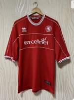
I remember it dividing opinion at the time as it was so far removed from anything we'd had before - but then we went and won the division which no doubt helped its popularity retrospectively. I've got the home and away shirts from that season but wish I'd bought the Cellnet branded one from the following year when it was an (unused) third shirt.
northernrower
Well-known member
Probably. It's one of my favourites.
Aztec chimera
Well-known member
That's very similar to the one that we made for them when boro made their own kits under the name Skill. If I remember right.I know it's not a Boro kit but this one that Barnsley have just released.
Makes ours look like a masterpieceView attachment 59457
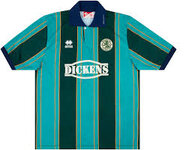
The worst ones were the ones with the big green Ramsdens logo. Just didn't fit the rest of the design at all. Really awful. It felt horrible to wear as well because it was a massive patch of that iron material which stuck to your skin when it got sweaty. Minging to look at and minging to wear.
Aztec chimera
Well-known member
This is the one I was thinking of, always thought Skill leisure wear made it but the link says it's made by beaver.That's very similar to the one that we made for them when boro made their own kits under the name Skill. If I remember right.
Piccadilly Day Tripper
Well-known member
I can't even name the player wearing the kit!
Colgates_shaving_foam
Well-known member
Me neither, I haven't even got a guess.I can't even name the player wearing the kit!
wilkos_perm
Well-known member
Andy HallidayI can't even name the player wearing the kit!
MichaelDebeve
Well-known member
Andy Halliday
The myth, the legend
One of my favourites that - most likely nostalgia for me though, it was the first full season i remember as a young boy and it being a promotion season just adds to it.
I remember getting the full kit as a Christmas present.
WillowsOrchid
Well-known member
The Tuncay kit for meAnother terrible away effort
goalscrounger
Moderator
Weirdly my brain went "Dean Windass" when I saw thatI wasnt a fan of this one just looks cheap and hardly any effort with the design
Trying to think which boro player comes to mind when i see this shirt
View attachment 59464


