You are using an out of date browser. It may not display this or other websites correctly.
You should upgrade or use an alternative browser.
You should upgrade or use an alternative browser.
Atletico Mascalucia
- Thread starter newyddion
- Start date
newyddion
Well-known member
I thought our rampant lion was different.. I might be wrong here but I was told the 1986 badge was designed a graphic designer from Dickens and they used a griffin from a book taken from Middlesbrough library.The rampant lion has been used on badges, flags and coat of arms for centuries so not sure we can have much claim to it. Interesting though.
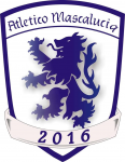
The Atletico Mascalucia badge is clearly a rip off.. I wonder what the connection is?
theredrooster
Well-known member
Anybody else spotted this Sicilian team playing in the 8th tier of Italian football..
View attachment 6589
Interesting stuff, well spotted.
The redesigned Boro badge is an abomination and it hurts my eyes just to look at it, Atletico are welcome to this badge for me and we can get around to creating a proper redesigned Boro badge with some fan input.
We might then have a badge to be proud of instead of some dusty old King Arthur Coat of Arms which Gibson (or someone senior at the club) has forced upon us.
newyddion
Well-known member
Yup that's the lion.. someone was telling me that our 'Lion' is infact a Griffin.. 3 points to Griffindor anybody?A Brilliant Club Name is that ' Mascal'....
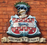
Anyway, this is why we have a Lion;
View attachment 6590
theredrooster
Well-known member
Yup that's the lion.. someone was telling me that our 'Lion' is infact a Griffin.. 3 points to Griffindor anybody?
If it's a Griffin then where the hell are it's wings?! I think whoever told you that was probably misinformed and talking out of their Griffin anus.
TheBoroBuzzard
Well-known member
Yup that's the lion.. someone was telling me that our 'Lion' is infact a Griffin.. 3 points to Griffindor anybody?
How would we now identify Roary, if this is true?
Johnny Vincents Motorbike
Well-known member
Yup that's the lion.. someone was telling me that our 'Lion' is infact a Griffin.. 3 points to Griffindor anybody?
' A Griffin' is a winged beast - no wings on Middlesbrough's Heraldic Lion Rampant.
Muttley
Well-known member
Roary is a non-binary mascot, come on get with the times people... ;)How would we now identify Roary, if this is true?
Michael_Vronsky
Well-known member
It's a griffin. Alistair Griffin...
newyddion
Well-known member
Interesting stuff, well spotted.
The redesigned Boro badge is an abomination and it hurts my eyes just to look at it, Atletico are welcome to this badge for me and we can get around to creating a proper redesigned Boro badge with some fan input.
We might then have a badge to be proud of instead of some dusty old King Arthur Coat of Arms which Gibson (or someone senior at the club) has forced upon us.
I would have liked to have seen the crest of Henry Bolkow used as our 'new badge' - i''m pretty sure it would have caused more controversy than the current badge. a bit like when the horse punchers kicked of about having seahorses on theirs.

the motto translates 'to undertake and to accomplish'
newyddion
Well-known member
I can't remember the exact points (unbelievable jeff) he was some heraldry buff, it wasn't straight forward, but I definitely remember a griffin being mentioned. Might have been b***ks.. maybe someone on here has heard or knows something similar. Why in heraldic terms it may not be a lion (or fully a lion)If it's a Griffin then where the hell are it's wings?! I think whoever told you that was probably misinformed and talking out of their Griffin anus.
FartingGnome
Well-known member
The badge we have now is a result of a Sevilla official commenting to Gibson after Eindhoven that Boro had come a long way since their founding in 1986. Hence the demand for a more "traditional" badge. The commercial manager at the time (think that was his job title) had a relative who was good this sort of thing and he came up with the original version of the badge we have now. If you think the one we have now is an abomination you should have seen the original. Hillprint were asked to make a better job of it, they said it was impossible, it needed redesigning from scratch, but they were told it'd already been shown and publicised, so they did the best they could with it, which wasn't much. It had been a total mess and the best they could do was make it look as if it was merely amateurish.
Last edited:
newyddion
Well-known member
I remember how bad it was when the design first came out. Beyond amateurThe badge we have now is a result of a Sevilla official commenting to Gibson after Eindhoven that Boro had come a long way since their founding in 1986. Hence the demand for a more "traditional" badge. The commercial manager at the time (think that was his job title) had a relative who was good this sort of thing and he came up with the original version of the badge we have now. If you think the one we have now is an abomination you should have seen the original. Hillprint were asked to make a better job of it, they said it was impossible, it needed redesigning from scratch, but they were told it'd already been shown and publicised, so they did the best they could with it, which wasn't much. It had been a total mess and the best they could do was make it look as if it was merely amateurish.

