
You are using an out of date browser. It may not display this or other websites correctly.
You should upgrade or use an alternative browser.
You should upgrade or use an alternative browser.
The championship
- Thread starter Paulh10
- Start date
WilliamMunny
Well-known member
Sorry Paul but I can't help it - it's called the Premier League 

Championship - how the table changed throughout the 2023/24 season | Sky Bet - "The Championship , the best league in the world 🙌 "Here's how the table changed throughout the season 🤯" | By Premier League Fan BanterFacebook
Sky Bet - "The Championship , the best league in the world 🙌 "Here's how the table changed throughout the season 🤯"
 www.facebook.com
Not that unpredictable this season. Other than Ipswich there were no surprises, but they were quite a big one. The 3 relegated teams have finished on 87, 90 and 97 points.
Rotherham being relegated wasn't a surprise, nor were the other teams that went.
All of the non-parachute teams are similar in terms of standards so it is competitive but with the ever widening finances I think the PL relegated clubs will be abeleto dominate he top end of the championship until something changes. The rest of us are hoping for a playoff lottery ticket.

 www.transfermarkt.co.uk
This table shows the "market value" of the playing squads for each team in the division. Sort it by the vale when the transfer window closed on 1st Sep 23. It's not far off the final table except Ipswich being the 4th lowest value.
It is always unpredictable week-to-week though. It's true that anyone can beat anyone. That doesn't seem to be the case in the PL anymore.
Rotherham being relegated wasn't a surprise, nor were the other teams that went.
All of the non-parachute teams are similar in terms of standards so it is competitive but with the ever widening finances I think the PL relegated clubs will be abeleto dominate he top end of the championship until something changes. The rest of us are hoping for a playoff lottery ticket.
Championship - Club market value
This page contains a statistic that shows a tendency of the development of the full market value of Championship up to the respective due date.
This table shows the "market value" of the playing squads for each team in the division. Sort it by the vale when the transfer window closed on 1st Sep 23. It's not far off the final table except Ipswich being the 4th lowest value.
It is always unpredictable week-to-week though. It's true that anyone can beat anyone. That doesn't seem to be the case in the PL anymore.
Frozen Horse
Well-known member
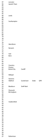
The discussion of dross earlier in the week got me thinking about whether the league table does lie. It doesn't, but it can be economical with the truth, and it can mislead by imposing a distance between teams that doesn't really exist.
I knocked this together to illustrate the point. As normal, teams are ranked by points, but here the difference between points totals is shown by distance.
Norwich are as close to Birmingham as they are to Ipswich. A normal table suggests to you that Norwich in 6th are much closer to promoted Ipswich than relegated Brum.
14 clubs are covered by 14 points which, over the course of a season, isn't very much. It's the same as the gap between Southampton and Norwich.
18 clubs are covered by 25 points. There really isn't much dross apart from Rotherham, and everyone is much of a muchness.
Attachments
Last edited:
That's a really good visualisation, great work coming up with it. It shows how tight the middle of the league was, but also really brings home how despite what felt like a decent season in the end (thanks to some recency bias no doubt) we were far closer to relegation (+19 points) than automatic promotion (-27 points).The discussion of dross earlier in the week got me thinking about whether the league table does lie. It doesn't, but it can be economical with the truth, and it can mislead by imposing a distance between teams that doesn't really exist.
I knocked this together to illustrate the point. As normal, teams are ranked by points, but here the difference between points totals is shown by distance.
Norwich are as close to Birmingham as they are to Ipswich. A normal table suggests to you that Norwich in 6th are much closer to promoted Ipswich than relegated Brum.
14 clubs are covered by 14 points which, over the course of a season, isn't very much. It's the same as the gap between Southampton and Norwich.
19 clubs are covered by 25 points. There really isn't much dross apart from Rotherham, and everyone is much of a muchness.
View attachment 76175
I really like that. I've talked many times about there being tiers to the league, especially how far backwards we have gone this season. Last season we were an automatic quality team and this season we have been a playoff quality team but there are, as this shows, half a league worth of playoff quality teams. I think we probably look like a WBA/Norwich type team if you did this with last season's table but we did have a disaster start and a management change. The post-Carrick version of that chart would show us right up alongside Burnley.The discussion of dross earlier in the week got me thinking about whether the league table does lie. It doesn't, but it can be economical with the truth, and it can mislead by imposing a distance between teams that doesn't really exist.
I knocked this together to illustrate the point. As normal, teams are ranked by points, but here the difference between points totals is shown by distance.
Norwich are as close to Birmingham as they are to Ipswich. A normal table suggests to you that Norwich in 6th are much closer to promoted Ipswich than relegated Brum.
14 clubs are covered by 14 points which, over the course of a season, isn't very much. It's the same as the gap between Southampton and Norwich.
19 clubs are covered by 25 points. There really isn't much dross apart from Rotherham, and everyone is much of a muchness.
View attachment 76175
Just sneaking in like WBA and Norwich have means they probably aren't anywhere near as good as the teams 15-20 points above them and will most likely not make it to Wembley or the PL. To be in with a decent chance of promotion you usually have to be an auto-contender.

sadgit
Well-known member
I was about to say, we aren't Rugby or Scottish..Sorry Paul but I can't help it - it's called the Premier League
Rofesleg
Well-known member
Is that what it said to you? A very glass half empty view.really brings home how despite what felt like a decent season in the end (thanks to some recency bias no doubt) we were far closer to relegation (+19 points) than automatic promotion (-27 points).
To me it showed that ourselves and Hull were a step above the 'also-run' teams all bunched together in the middle.
Frozen Horse
Well-known member
Is that what it said to you? A very glass half empty view.
To me it showed that ourselves and Hull were a step above the 'also-run' teams all bunched together in the middle.
I think that visualising the league like this is useful when talking about the comparative quality of teams (i.e. why can everyone beat everyone else). Although a conventional league table forces all teams into a rigid order, the reality is there isn't much difference in quality for over half the division.
At the same time, a season isn't about the number of points you get: it is about the place in which you finish. You don't get promoted when you reach a certain level of points after all, you get promoted for finishing first or second. Thus WBA win the title with 81 points, and Leeds miss out with 90 in a different season. Heck, it's mathematically possible to be champions with 46 points and the worst defence in the league.
I do share your belief that we were, overall, slightly better than the average sides and that that the upheaval over the summer and injuries dragged us a back towards the pack a little. However, I'm sure every club has its reasons why they're not higher.
NorthumberlandBoro
Well-known member
You really didn't have to be THAT good to make the playoffs.
Frozen Horse
Well-known member
You really didn't have to be THAT good to make the playoffs.
73 seems about par for the course to me.
6th has been quite a bit higher with 80 points in recent years, but it's been lower than 73 twice in the last 4 seasons too.
Some right dross made it in with only 69 points last season.